


It's all in the details: 2025 WAGs Playoff Jackets
You can't outdo the doer!


Hey..... hey.... how y’all doin?
We know it’s been a minute since you heard from us. A lot has happened since last year: new jobs, a new city, and new projects. We were pretty occupied, so we took a break from writing and producing new issues for our beloved newsletter because we knew if we didn’t, the quality wouldn’t be up to par with our established standards.
However, the playoff season means WAG Jacket Season, and we couldn’t let this pass without doing at least one more Official THWL WAG Jacket Review! The tradition has grown exponentially since we first started, and because there has been a lot of discourse about it, we felt the need to bring it back to its roots. As the subtitle says, you can’t outdo the doer!
As a quick aside, we want to remind everyone that we’re here to criticize fashion. With the rise of WAG influencers and shifting fandom etiquette, we think that it’s important to say that art and fashion are allowed to be critiqued without being accused of being “mean” because of the parasocial relationships someone may have. Frankly, if you think saying a jacket is ugly is too harsh, a Vanessa Friedman critique would have you sobbing on the floor.
That said, because the ladies are getting more creative with their choices, we decided to be stricter with our Rigorous Academic Process by examining the incorporation of the team’s palette, originality, element placement, and font type & readability.
Now that's out of the way, let's get into it!
The Rosewoods
This type of font draws a lot of attention for its originality and is about making a visual impact, similar to what the teams did in this category.
Edmonton Oilers
Lauren Kyle and the Edmonton women are back this year with a look from her new company, Sport Club Atelier. As is customary with many of her designs, Kyle took inspiration from trendy brands or pieces. This year, it’s the Bottega Veneta Intrecciato leather collared coat, most recently seen in their 2025 Spring RTW collection. These appear to be some type of suede, and while the color is fine, everything else seems to be an issue. On the back, there is a cacophony of fonts and textures going on to the point that it took us a hot minute to realize that the players' names were embroidered on. The weird spacing between the words and the choice to emboss the brand logo on the back make it seem like a lot of dead space is going on. Plus, you can't really see that or the embossed number on the front. 4/10

Los Angeles Kings
The LA Kings WAGs have been our perennial contenders for the Go Girl, Give Us Nothing award, but that worked out in their favor this year. After years of trying out chic looks that just looked boring, the girls finally hit it on the head, this time with what appears to be a structured black denim blazer. Aside from being a nice change from all the leather jackets, the additional elements were strategically placed; logos on the breast pocket and sidearm and readable names and numbers on the back. Not too much and not too little, but still a concerted effort - very LA of them. 6/10

New Jersey Devils
New York designer Kevin Leonel, the same artist who created the Boston Bruins jackets two years ago, made this year's jacket for Devils WAGs. While we prefer the model he made to sell on his website, we still appreciate his unique approach to the coat. We liked the kind of kitschy, camp vibes with the brocade fabric, sparkly brooches, and glitter outlines on the patches. It's giving Real Housewives of New Jersey. Ultimately, though, because there is all this grandiosity going on, it's hard to distinguish the elements that make it a WAG jacket, e.g., the names and numbers of the affiliated players. 7.5/10

Toronto Maple Leafs
In all honesty, there has yet to be a Leafs jacket that leaves us even mildly impressed and this year - despite their effort to be more unique - was no different. Line Change Co. made the 2025 edition of these jackets, and we got a standard baseball jacket made with what looks like some teddy boucle with embroidered (maybe?) elements on the back. The fabric seemed very flat as if it had been pulled straight from a dropship plastic bag without any brushing or adjustments, which is the opposite of the plush look this type of fabric should give. The remaining elements on the back (e.g., the numbers, skyline and team name) are oddly aligned, giving it a crowded, awkward look. Better luck next year. 2/10
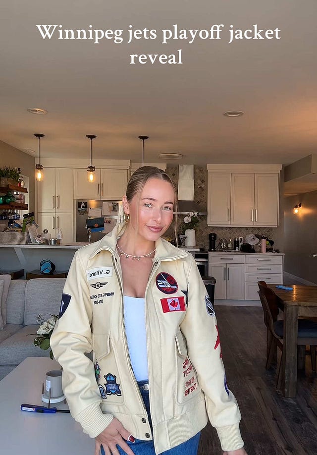
Winnipeg Jets
The Winnipeg Jets went full RCAF aviator vibes, giving us off-white leather bomber jackets. While we saw some comments saying they were not doing the Winnipeg Whiteout correctly, we’d argue that a stark white leather coat would have given less Top Gun and more commercial pilot. We do have to give the Winnipeg ladies their props because they are always trying out new things and fully embracing the showmanship that comes with this tradition. That being said, though, there was SO much going on. It felt like we saw every version of the Jets logo ever made. In turn, the excessiveness made the patches and name tags on the back too overwhelming. However, we appreciate that the names are readable. 4/10
 Tiktok failed to load.
Enable 3rd party cookies or use another browser
The Times New Romans
Time New Roman is the classic typeface. Familiar, dependable and not necessarily impressive, like having a bomber as the baseline.
Carolina Hurricanes
Well, it's a jacket, that's for sure. This year, we got some High School Musical energy with red satin bombers that look like something we would have gotten at American Apparel in the 2010s. Big numbers on the front that may or may not refer to the infamous Taylor Swift WAG debut look. 2/10
https://www.instagram.com/s/aGlnaGxpZ2h0OjE4MDM1Njg2ODkyNjI1Njk1?story_media_id=3621941890270897927&igsh=dW1qc2N2OG41YXN3Minnesota Wild
For some reason, the Wild's jackets always seem to be the middle-of-the-road marker for us. After a year off, the ladies returned with their best effort yet. The dark green leather jackets worked much better than expected, and the back was great. The cursive for the names was legible, and the red outline on the numbers was a good way to incorporate an extra pop of color. However, they took minimalism a little too far, and the logo is not eye-catching enough, so it looks less like a unique occasion jacket and just, you know, a jacket. 5/10
 Tiktok failed to load.
Enable 3rd party cookies or use another browser
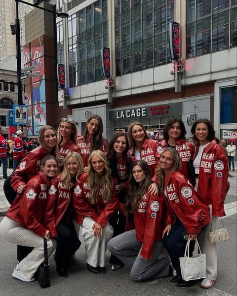
Montreal Canadiens
This is the first year we have seen a Montreal jacket since we started these rankings, so welcome! Overall, it was a solid start and one of the best executions of red leather jackets we've seen in all these years. The backs were excellent, with names and numbers clearly visible and not doing any weird overlap with the seams. We also like that the team's name looks very balanced in the front. Its biggest flaw is that there were too many patches, making it look crowded. Do we need so many versions of a team's logo and NHL affiliation? 6.5/10
Washington Capitals
For their jackets, the WAGs decided to go with the Canadian brand IN|HOUSE Design Studio, which did the Canucks’ jackets last year. As we mentioned before, their execution always seem weak. Another issue was too many elements: stars, logos, names, numbers, and signatures. If you name it, they probably got it! The numbers on both sides of the arms were huge and repetitive. The names on the collar were unnecessary because we barely saw them when the jacket was worn. Plus, point off for the signatures, as usual. Also, we must stop using chenille patches on satin fabrics. They look weird every single time. 3/10Side note: We understand they are celebrating an anniversary, but they need to let that poor bird get some rest for the love of god. We've seen all the variations. Let's start bringing out some of their other logos, pls!

The Helveticas
Helvetica remains the world's most popular font, just like leather stays the WAGs fabric of predilection!
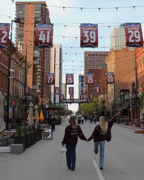
Colorado Avalanche
The Avs’ color palette is unique compared to the rest of the teams, making them stand out every time. While most teams have adopted similar cursive lettering, the Avs have executed it with a level of cleanliness that we find particularly impressive. The only downside is the placement of the name and logo on one side and the number on the front, which creates a slight imbalance when you look at the jacket as a whole. However, they earned some points for the fit, which is just right, and for avoiding repetitive elements. 5.5/10
Dallas Stars
The Dallas girls have given us some looks, but they are equally inconsistent, and this year seems to be one of their down years. There isn’t much to say. The main element, the numbers on the back, is barely noticeable, so… we’ll give them some points for the fit, though. Go Girl Give Us Nothing/10

Florida Panthers
In 2023, we said that the Carolina Hurricanes, who have a similar palette, would benefit from a racer jacket if they wanted to do leather. We’re glad that someone finally took us up on it. Oversized jackets were a big theme, so seeing a slimmer-cut jacket that sits at the hip was a nice change of pace. The back was pretty straightforward but well executed, though, at this point in the review, we are asking, nay begging, folks to leave the knock-off Aimé Leon Dore/Loro Piana fonts alone. The only thing we had an issue with was the patches on the arms that cut off the flow of the stripes down the arms. 8/10

Ottawa Senators
After an 8-year playoff drought, we also welcome the Ottawa Senators to this year’s rankings. Unfortunately, their first appearance wasn’t as strong as the Habs. A tan leather jacket as a baseline was a risk that didn’t pay off. Was it the artist’s choice to paint over the seams, or was the jacket made like that? Whatever the answer is, it looks off with the rest. They also decided to take some elements of the team’s logo instead of painting the whole thing. It ended up looking like the Flyers’ logo. The names on the arm and the back were stamped over the seams, a big no-no in our book. Lastly, they lost points for the signatures. Hopefully, they’ll be back to show next year. 2/10
 Tiktok failed to load.
Enable 3rd party cookies or use another browserSt. Louis Blues
Their jackets are very reminiscent of the 2024 Oilers WAG jacket. The lack of utilization of the team's colors is unfortunate because it would add a little pizzazz to the piece. The names on the back and the players' initials on the side are repetitive. However, we get it; they wanted to fill in the space because it's true that the way they incorporate the elements makes the jacket look full. Besides that, there isn't much to rave about. 3/10

Tampa Bay Lightning
Ben Weiner designed the leather jacket in collaboration with Sanna Hedman, Victor Hedman's wife. Ben also created last year's jacket for the Boston Bruins; every year, he impresses us with his work and clothing quality. We loved the front, but the problems occurred on the back. The team's full name took up too much space, making everything at the bottom too crowded. The name patches were too small and oddly placed, making reading challenging. 6/10

Vegas Golden Knights
Lauren Kyle's Sport Club Atelier did another custom set of leather jackets. The biggest fault in the execution was how oversized they were, to the point where some of the detailing gets lost due to the fit. As is the issue with a lot of Sports Club Atelier clothing, there are a lot of fonts and weird leading (i.e. spacing) between all the text. Also, the Vegas Golden Knights patch on the front is nonsensical. 5/10
 Tiktok failed to load.
Enable 3rd party cookies or use another browser
The 2025 WPJOY winners are the Florida Panthers - congrats ladies!
Whew! It’s been a minute since we’ve put our brains to use for hockey-related shenanigans, and we are so happy to be back! In order to support our work, THWL is moving to a subscription-based model. Our archive and any new posts will be locked, but there will be the occasional free posts.
With love,
Perrye & Gaby
Yessssss