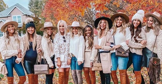
Playoffs season also means seeing the jackets worn by the Wives and Girlfriends during games. On Monday’s Other Thoughts, we called it Hockey’s Very Own Met Gala, but upon further reflection, we might have been a little too ambitious. We’re getting more of a REVOLVE festival feeling.
I - Gaby - would like to note that out of the two of us Perrye is definitely the more stylish one. What I do have though is the audacity and an impressive array of opinions on the current fashion industry (it was one of my hyperfixations for a while). So, if you see me in the streets looking like a particularly comfy gremlin, mind ya business.
We divided the looks into major categories and using our Rigorous Academic Process have scored them out of 10 based on fit, design, and originality. Let’s dive in!
The Leather Girlies
These three teams went pretty simple… Name, number and logo in big color font on a Black leather jacket. We don’t expect people to drop serious cash on something they might only wear a few times, so we’re giving the girlies a break when it comes to material quality. Good leather is expensive!
Florida Panthers
We couldn’t find a lot of group shots of the jackets, but we tried our best. The cut of this particular jacket is your dad’s leather jacket from the 90s that you pulled out of the back of the closet. We don’t actually hate it, and it’s giving the right amount of oversized. However, the prints on top look a little too stark, given the color scheme for the team. The Panthers logo on the back is too large, and the player number on the pocket is too small and looks awkward. - 5/10: The design may have been cuter on a denim jacket, maybe.
Dallas Stars
Goth Dallas Stars is the best version of the Dallas Stars, so we’re absolutely here for the color scheme. Motorcycle jackets are universally flattering, so an excellent choice made on the cut. We got group pics, and the styling was somewhat varied with no glaring missteps, though we wished they had leaned more into a bikercore look. We could have gotten some Angelina Jolie Femme Fatale realness. We took a point off because the signature on the back seemed unnecessary given the player’s name and because wearing any man’s signature gives us a little bit of the Ick. - 9/10
St. Louis Blues
The Blues Better Halves (their official name) actually had two different jacket styles. One of them was a subdued motorcycle jacket and the other a wool-blend (we think) letterman jacket with leather sleeves. The moto jackets were fine, but the letterman jackets were cute and had that oversized look without it looking like they were drowning in them. The designs on the jackets themselves were very meh. However, the blue and yellow color scheme worked out a lot better for them than for the Panthers. Very middle of the road so - 6.5/10
The Clean Girl Aesthetic
Gaslight, GirlBoss, Gatekeep.
Okay, time to let Gaby go on a little rant: Perrye - the absolute gem that she is - was the one who did the leg work of gathering all the pictures and sorting them out. When she wrote Clean Girl Aesthetic, I didn’t know what she meant because I am getting hashtag old. Reading the name alone made me squint, and things that make me squint tend to not be Good Things. I did my research, and yeah, I was right. The entire aesthetic appears to be some distorted version of minimalism fully embraced by white women who get most of their fashion inspo from Hailey Bieber. What the fuck does “clean girl” denote? I don’t trust the implications.
Toronto Maple Leafs
Not a lot of clear pictures, so we’re thinking white chambray? Kind of like a boyfriend shirt feel. Not much to say because they’re quite plain and inconsistent in the lettering on the back. It’s a shame they didn’t do more because the Maple Leafs Blue is actually quite fun. An extra point for Tessa Virtue’s presence, even if she didn’t wear the coat and that Morgan Rielly scares the absolute shit out of Gaby. - 4/10
Pittsburgh Penguins
Y’all are going to a hockey game; why is the vibe “blazer I bought at Shein for my corporate job?” Is it beige? Is it yellow? Regardless, it’s drab. They should have gotten them tailored to be equally flattering on everyone. There are quite a few rolled cuffs and awkward lengths, particularly on the shorter gals. The art is hand-painted, which was cool, although the shield crest gave more cop energy than hockey. The player number on the front pocket was awkward and would have probably looked better filled in. The weirdest part was the skyline on the back. At first glance, it looked like the bottom of the blazer had been bitten off by a shark. There was a second knock-off drew house hoodie, which we chose to ignore. Additional points were lost because Evgeni Malkin’s partner Anna, the best Lady Pens, did not partake. - 2/10
New York Rangers
White Blazer with padded shoulders and fully embracing the Red, White, and Blue. There’s not much to say here because they’re boring, but we like the two tones on the number. Not particularly offensive but also kind of lackluster - 4/10
Minnesota Wild
Okay, PGA Tour! Very Masters Green Jacket (we know nothing about golf). The lettering and the logo on the back are awkward because they both look too small. We would have flipped it around and put the logo on the front and the player numbers on the back. The forest green color was cute. Much like Minnesota as a state, kinda meh and average. - 5/10
The Bomber/Varsity Situation
Perrye fully believes that at your big age, you shouldn’t be wearing a varsity jacket. Is this high school? Are we playing football? What is going on? However, not up to us, so we’ll be fair.
Los Angeles Kings
Go girls give us nothing!
We don’t have much to say since there wasn’t much to criticize. The number could have been more prominent, but does it really matter? The jacket would have still been dull. The lack of creativity is truly disappointing. It’s unfortunate because the Kings have such an exciting color palette and so many possibilities compared to other teams. If they need advice on next year’s jackets, they can contact us. We have a couple of ideas for them. - 0/10
Washington Capitals
We don’t think we’ve seen Comic Sans Extra Bold on clothing before. The jackets seem to completely overwhelm some of the wearers. This is oversized done wrong. They look like lightweight puffers from some angles and from others like a windbreaker? Putting Washington over the player’s numbers instead of their names was certainly A Choice. What was the reason for the black color scheme? Y’all got a few colors to play with. The all-black theme would have been cute if the execution had been done right but alas. - 1/10
Nashville Predators
So many questions! Why baby blue? Why the repetition of numbers in front and the back? Also, do y’all think some of them did roman numerals on their jackets because the captain is Roman Josi? Like we’re not even being facetious, lol.
Everything about this jacket is so all over the place that we can’t even come up with reasons to give them points. Except for the size of the number and the name on the back. It’s big enough to be noticeable, and the font is crisp and clean. Other teams can at least take notes on that. - 1/10
Carolina Hurricanes
As we mentioned earlier, teams automatically get a deduction if they have a signature on their jacket. However, we're removing only a half-point since it was just a couple of ladies in the case - though the bedazzling was an interesting touch. As for the rest of the coat, it's nothing to write home about. Instead of the team's name in front, we would have put the logos on the front and the name on the side like you would on a military jacket. - 5.5/10
The Creative Attempts
They’re called the creative attempts because, well, they tried.
Boston Bruins
Nashville in Boston… I guess!
The fringe is falling over the number, which makes it weird. The bedazzling is not consistent from one jacket to another. If we were in charge of designing the jacket, we would have put the fringe from the front to the back, the number in front and the name larger on the back. The way everything is currently formatted makes everything look too crowded. We see the creative vision, but if they wanted to go the country look route, they should have gone all out camp. More sequins! More fringe! Give us Miss Dolly Parton, y’all! - 4/10
Calgary Flames
Like Matthew Tkachuk on the ice, the Flames jackets are absolutely chaotic. Bedazzling? Name on the front? Patches? Who knows!
The consistency on these jackets is barely existent, so it was hard to give them a solid opinion. The red jean jacket with the flame in the back is a charming idea in theory, but in execution, it falls flat. Overall, it gives us Marshall from Paw Patrol. - 3/10
As for the white jackets… if we speak, then we’re the bad guys. Chun-Li! - We just hope the artist was paid well/10
Colorado Avalanche
This team is a little confusing because they seem to have a sweater as official merch, but others were seen with jean jackets or bombers. For this commentary’s purpose, we’re going to use the crop-top crewnecks made by Madison Fidler. We respect Madison’s dedication and talent, who made tons of sweaters from scratch. The final product is cute but not as impressive as other teams. When we think of playoff jackets, we want fun and original - not relatable. - 6/10
Edmonton Oilers
We saw a lot of people hating on this one, but we actually don’t mind it! It seems to be this cropped jacket with houndstooth print from Zara. Like all fast fashion, Zara tends to “borrow,” so we see a lot of influence from this Maryling S/S 22 cropped tweed jacket, Valentino Resort 2022, and Chanel’s infinite iterations of tweed. It’s generally cute and trendy! The Pantone Fashion Color Report has featured oranges for the last couple of seasons, so the Oilers’ colors get a pass this time around. Y’all can thank those 70s trends for coming back around. They lost significant points for the *truly* horrendous font they chose for the names in the back. Someone called it Ye Olde English which, yeah, fair enough. Why would they choose this? It’s unreadable! We also think the logo would have looked better on the front of the jacket instead of the side. The jacket’s styling was all-around weak, which made them look worse than they really were. We would have embraced the high fashion aesthetic it’s trying to emulate. Think Mean WASP Trophy Wife or Margot Robbie in Wolf of Wall Street. - 7.5/10
Tampa Bay Lightning
We’re honestly speechless and sorry for the atrocity y’all are about to witness.
We were unable to find a better picture of the jacket, so the whole product might be better than what we currently have. However, we are not here to assume but to judge what’s in front of us, and it’s terrible. They seem to have two different styles of jackets stitched together. On the one hand, we have the classic jean jacket in black with lighting and numbers in light glitter. On the other, a hybrid baby blue zipper hoodie on top of the jean jacket with the team logo and name. I’m so sorry, but you would catch us dead before you see us wearing something this hideous and unorganized. Coming from a team attempting a three-peat, we expected more (and better). - 2/10: one point for each side.
Overall Winner for 2022: Dallas Stars WAGs. Congrats ladies!
The WAGS playoff jackets are a really cool tradition, and we hope that they continue doing it and that they only get more extra. As an aside, we have to say, we don’t think we’ve ever stared at so many blonde white women for so long before. But we had fun! Thanks for joining us; we’ll see y’all next Monday!
Toodles!
Gaby and Perrye